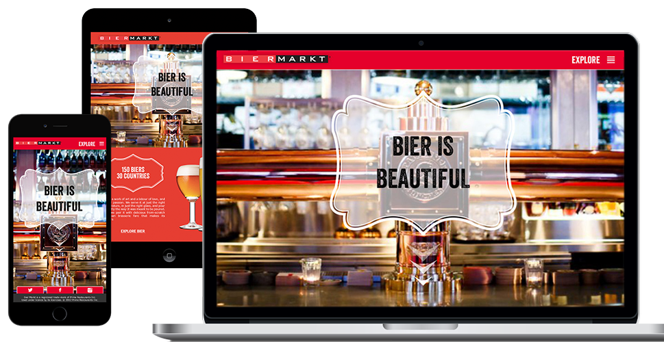
The Bier Markt
Client: The Bier Markt
Platform: Website
The Bier Markt wanted visitors to the website to be reinforced with the idea that they were experts in bier (German for beer), food and entertainment. If a customer was looking for an experience containing any combination of these categories, The Bier Markt should be the first place they would go.
Showcasing the company's three pillars of expertise
We decided to introduce the three pillars of expertise to users right on the homepage.
We introduce bier through the company's overarchiving bier philosophy along with a call to action to dive deeper into the Bier Markt's offerings. Because of the impressively large bier selection found at the Bier Markt, we chose to have this section be the first thing a user encounters. It helps establish bier as being the first priority of expertise of the Bier Markt.
Next, we decided to showcase the food at the Bier Markt. We chose to go with an image of one of the more popular main staple items from the menu - the charcuterie board. This would allow the users to quickly make the connection that the Bier Markt was more than just about bier, but it also had delicious food offerings as well. They could click on a CTA that took them to the food section where they would view each location's food menu.
The final section of the homepage was the entertainment section. This content was being updated every week and we felt it needed to be showcased upfront so that users could quickly access that week's entertainment lineup. In order to efficiently deliver this information to the user, we needed to add some hierarchy to the content, as well as add some minor functionality in order to sort the amount of content being displayed.
We divided this section into two parts. On the left-hand side we listed daily events at the bar. These events, such as Sunday Brunch and Oyster Mondays, were pretty consistent throughout the year and didn't really change all that much from location to location. On the right hand side we put up the weekly entertainment lineup. Using a series of drop-down menus, a user was able to quickly select their local restaurant to find out what the lineup schedule was for the next month.


